
I would also recommend "softening" the lines between the holy symbol and the "head" of the spell. The hard corners on the tail of the spell look out of place.
View Single Post
-
2017-07-17, 08:32 AM (ISO 8601)Ettin in the Playground

- Join Date
- Aug 2011
- Location
- Sharangar's Revenge
- Gender

 Re: OotS Style Art/Fanart Showcase VI
Warhammer 40,000 Campaign Skirmish Game: Warpstrike
Re: OotS Style Art/Fanart Showcase VI
Warhammer 40,000 Campaign Skirmish Game: Warpstrike
My Spelljammer stuff (including an orbit tracker), 2E AD&D spreadsheet, and Vault of the Drow maps are available in my Dropbox. Feel free to use or not use it as you see fit!
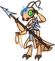
Thri-Kreen Ranger/Psionicist by me, based off of Rich's A Monster for Every Season
