Results 1 to 30 of 339
Thread: 4e Art Direction
-
2008-03-20, 10:09 PM (ISO 8601)Bugbear in the Playground


- Join Date
- Mar 2006
- Location
- Piercing the heavens!
- Gender

 4e Art Direction
So I happened to be flipping through the two preview books today while I was waiting for my lenses to be fitted so I could see more than 7 feet past my face. I must say I am quite impressed by some of the artwork, especially the scenery they have for exotic locales like the Feywild, Astral Sea, and Shadowfell. The character designs have an interesting look as well, it's a definite step up from Mialee who was, to be blunt, ugly as sin. Some of the Epic Tier illustrations looked pretty funny though since they're decked out in rather ridiculous-looking gear.
Anyway, let's keep this to the art direction shall we? There are plenty of other threads to harangue about the mechanics and fluff as-is.
Incredibly GAR avatar by Ninja_Chocobo.
-
2008-03-20, 10:16 PM (ISO 8601)Ogre in the Playground
- Join Date
- Mar 2007
- Gender
Re: 4e Art Direction
Quoted for emphasis. Originally Posted by Behold_the_Void

-
2008-03-20, 10:19 PM (ISO 8601)Retired Mod in the Playground Retired Moderator

- Join Date
- Feb 2007
- Location
- Northern California
- Gender
Re: 4e Art Direction
Too many pretty adventurers. More ugly ones is a fairer representation of a group that tends to dump Charisma.
Visit the Chocolate Hammer IRC channel!
(IRC Joining Guide Here!)
-
2008-03-20, 10:22 PM (ISO 8601)Ogre in the Playground

- Join Date
- Oct 2007
- Location
- bouncing around the world
- Gender
Re: 4e Art Direction
i was very disappointed with what they did to the green dragon's asthetics. is he supposed to be some sort of narwhale or something?
so sad. wayne reynolds is my favorite wizards artist, but i can barely manage to look at his green dragon. bring back the 3.0 lockwood green dragon.my own diabolical experiments (homebrew)
my deviantART
my alter ego
Campaigns
WatchtowerVolume III (running since 2008)
Announcer Your cable television is experiencing difficulties. Please do not panic. Resist the temptation to read or talk to loved ones. Do not attempt sexual relations, as years of TV radiation have left your genitals withered and useless.
Wiggum, checking Well I'll be damned.
-
2008-03-20, 10:25 PM (ISO 8601)Firbolg in the Playground
- Join Date
- Oct 2006
- Location
- Indiana
- Gender
Re: 4e Art Direction
This. 3e's dragon art was awesome as it was; there's no need to screw it up. Originally Posted by Stycotl
"Courage is the complement of fear. A fearless man cannot be courageous. He is also a fool." -- Robert Heinlein

-
2008-03-20, 10:27 PM (ISO 8601)Bugbear in the Playground

- Join Date
- Aug 2007
- Location
- Oahu, Hawaii
- Gender
Re: 4e Art Direction
I don't care how ugly the characters are, as long as the art is pretty.
I mean, I can do better than some of the things in the 3.5 PHB and DMG. -_-Paragon Badger (14 HP)
Str 23, Dex 32, Con 30, Int 17, Wis 27, Cha 19
AC: 33, Claw: +29 Melee (1d2+19)
Body byJakeArmy. Avatar by Kyace.
-
2008-03-20, 10:33 PM (ISO 8601)Banned
- Join Date
- Sep 2007
Re: 4e Art Direction
I'm curious as to how they'll illustrate the succubi, myself. I and many others consider that pic one of the best in 3.5 (Along with the Golden Soulborn, pity THAT one leeched off all the coolness off of the class itself), and it's going to be very difficult to one up that one.
-
2008-03-20, 10:34 PM (ISO 8601)Troll in the Playground

- Join Date
- Jan 2007
- Location
- Eastern NC
- Gender
Re: 4e Art Direction
I agree about the Green Dragon, but I do like some of the new art overall. I'm not as fond of the character art, but I love the various landscapes and things like that. I think one of my favorite D&D pictures I've seen is from "Worlds and Monsters" - it's the one of the pleasant little village that just happens to have big crumble dragon-head ruins/statues all around it.
That'd be cool, but for 3.0 art I'd much prefer if all new Tieflings looked like the one from the 3.0 MM. Originally Posted by Stylcotl

@V: Here's the Worlds and Monsters art gallery. The Green Dragon pic is here.Last edited by RTGoodman; 2008-03-20 at 10:44 PM.
The Playgrounder Formerly Known as rtg0922
Homebrew:
"Themes of Ansalon" - A 4E Dragonlance Supplement
Homebrew Compendium
-
2008-03-20, 10:38 PM (ISO 8601)Pixie in the Playground

- Join Date
- Feb 2008
- Location
- San Diego, CA
- Gender
Re: 4e Art Direction
Would any of you happen to have links to some of these pictures? Particularly the Green Dragon. I would like to see how they were done if possible.
-
2008-03-20, 10:44 PM (ISO 8601)Bugbear in the Playground
- Join Date
- Mar 2006
- Location
- Piercing the heavens!
- Gender
Re: 4e Art Direction
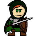
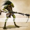
Green Dragon
Dragonborn Fighter
Adventuring Party
Rogue
I can't find any of the landscape pictures which is a shame because those are REALLY nice.Last edited by Behold_the_Void; 2008-03-20 at 10:46 PM.
Incredibly GAR avatar by Ninja_Chocobo.
-
2008-03-20, 10:47 PM (ISO 8601)Banned

- Join Date
- Mar 2008
- Location
- Århus, Denmark
- Gender

Re: 4e Art Direction
While i do not like all the pictures i have seen so far, the art direction of 4e seems to go for a simpler less overwrought style than 3.5 which is something i can wholly get behind. In general i prefer the black and white art from many early 3.0 supplements to the rather extreme and somewhat absurd art of much of 3.5 and 4e seems to be moving closer to the style of early 3.0 than the direction of 3.5. Also i hope they really abandon the monstrous look for succubi that they had adopted towards the end, seduction and lust personified should not have huge claws, damnit.
-
2008-03-20, 10:47 PM (ISO 8601)Dwarf in the Playground
- Join Date
- Dec 2007
- Gender
Re: 4e Art Direction
You can find most of the stuff about a quarter down the page here. Originally Posted by Crowheart
As for myself, I'm really on the fence leaning towards liking the new style. I see a few things that I like (such as dwarven women, hubba hubba ) but, well, the green dragon is meh. Tieflings I really can't say much about them. I like them, the eldritchy feel is there, but I much preferred the drawing of them in the 3.5 planar handbook.
Sometimes you eat the bar, and sometimes, well, he eats you.
) but, well, the green dragon is meh. Tieflings I really can't say much about them. I like them, the eldritchy feel is there, but I much preferred the drawing of them in the 3.5 planar handbook.
Sometimes you eat the bar, and sometimes, well, he eats you.
-The Stranger, "The Big Lebowski"
-
2008-03-20, 11:25 PM (ISO 8601)Ogre in the Playground
- Join Date
- Oct 2007
- Location
- bouncing around the world
- Gender
Re: 4e Art Direction
oh yeah! and the new dwarven abstract geometric design stuff--what's up with that? i feel like they are all new mexico natives now. maybe the dwarves have traded in their smithying and masonry skills for adobe application and craft (art-deco) or something. martha stewart will be the new principle dwarven deity.
i liked the 3rd ed dwarven style. lots of metal, lots of grotesque faces on their shields and belt buckles, horns and claws on their armor. not the wlking billboard of the geometer's guild that they have going on now.
as you can see, i'm a little miffed with some of the direction the art has taken.
realize that this is all rant, and that after i get it out of my system, i will be able to rationally and fairly discuss all of the cool things, of which there are many, that they have done.
aaron out.Last edited by Stycotl; 2008-03-20 at 11:26 PM.
my own diabolical experiments (homebrew)
my deviantART
my alter ego
Campaigns
WatchtowerVolume III (running since 2008)
Announcer Your cable television is experiencing difficulties. Please do not panic. Resist the temptation to read or talk to loved ones. Do not attempt sexual relations, as years of TV radiation have left your genitals withered and useless.
Wiggum, checking Well I'll be damned.
-
2008-03-20, 11:56 PM (ISO 8601)Ogre in the Playground
- Join Date
- May 2006
- Gender
Re: 4e Art Direction
It's at moments like these that I thank God my imagination comes with a fuse box. Originally Posted by an kobold
I dunno. I mean, the faces and horns and claws make a lot of sense for dwarves-as-Vikings. But they don't make as much sense for dwarves-as-orderly-machinists. Originally Posted by Stycotl
So I think it's kind of a wash. Depending on what they do, I think the geometric dwarf styles could be a really good idea.My favorite exchange:_______Spoiler Originally Posted by Betty
Originally Posted by Dervag
Originally Posted by Mikeavelli
-
2008-03-20, 11:57 PM (ISO 8601)Retired Mod in the Playground Retired Moderator
- Join Date
- Apr 2004
Re: 4e Art Direction
Well, in addition to some awesome landscapes, I gotta say some of my favorite art I've seen are the new Angels. I like emphasizing the mystery and terror of divine servants from beyond the mortal realm, as opposed to modelesque humans with wings and glowing eyes. The mask-like faces are an especially nice touch.
I'm not sold on the dragonborn art. Some of them, like that Wizard with the wings, or the one in the Rogues section of Races and Classes look nice, others, like the Warlock heading up the Dragonborn writeup just look odd to me.
I also really liked the elemental archons as well. Some of the better renderings of Elementals I've seen yet (most are either too complex, so you loose the elemental in anatomical detail, or too simple, so you aren't so much looking at a creature as just an undefined mass of the element in question).
Oh, and there's one of the examples of Dwarven armor that looks like Optimus Prime or something, as opposed to something out of a Dwarven smithy, but hey.
Last edited by Grey Watcher; 2008-03-20 at 11:58 PM.
-
2008-03-21, 12:29 AM (ISO 8601)Troll in the Playground
- Join Date
- Jan 2006
- Location
- Protecting my Horde (yes, I mean that kind)
Re: 4e Art Direction
I like the dwarf armour, its heavy, simply shaped but heavily ornamented, and most of all functional. Originally Posted by Grey Watcher
-
2008-03-21, 12:38 AM (ISO 8601)Titan in the Playground

- Join Date
- Nov 2006
Re: 4e Art Direction
Does anyone know if the Chainmail bikini syndrome still hounds 4e? I wonder if they clothed females more sensibly than in the past. Those armor protect everything except the vital organs!
-
2008-03-21, 12:43 AM (ISO 8601)Bugbear in the Playground
- Join Date
- Mar 2006
- Location
- Piercing the heavens!
- Gender
Re: 4e Art Direction
Most female characters are, as always, busty and lacking practical armor.
Incredibly GAR avatar by Ninja_Chocobo.
-
2008-03-21, 12:45 AM (ISO 8601)Retired Mod in the Playground Retired Moderator
- Join Date
- Apr 2004
Re: 4e Art Direction
Well, it's just the one image. If you happen to pick up a copy of Races and Classes, it's on page 31, bottom row, third from the left. The rest of the armor and such, I like, but that one suit looks like he's about to turn into a jet plane or something. Originally Posted by Beleriphon
Eh, they can't seem to shed it entirely, at least for characters who favor light armor to begin with (Wizards, Rogues, etc.) still, you seem to see a lot more female fighters and warlords, at least, more sensibly dressed. Even if the breastplates really do overemphasize the breast part.... Originally Posted by Frosty
-
2008-03-21, 12:45 AM (ISO 8601)Firbolg in the Playground

- Join Date
- Jan 2008
- Location
- Georgia, USA
Re: 4e Art Direction
I don't like the racially-styled weaponry, especially not the tiefling blade concept art from Races and Classes. That dragonborn linked to earlier, I don't like its sword and shield either (armor's fine, though). The blades have all these extraneous twists and barbs and whatnot (they all end up looking like some sort of flammenschwert-steak knife bastard child) and the shields are in completely nonsensical shapes, most of which seem likely to hurt someone.
Granted, most of the 3E shields were already worthy of complaint, but adding to the list of problems by messing the swords up (messing them up even further, that is...) just makes it worse.
And I hadn't seen that green dragon before. How terribly disappointing. Love the dual wielding... uhh... rogue? Swashbuckler? Girl with cutlass! in the same pic, though. Oooh, makes me wonder if the cutlass will be an actual separate weapon in 4E (not at all likely).
I'm surprised to say that the dwarven (or stocky human, I guess) rogue? looks great, though.Current Games:
SpoilerGMing The Lotus Blossoms! [Exalted 3E] (OOC)
Playing Waldaharjaz in The Convergence of Sky [Exalted 3E]
Playing Rivers in Welcome to Thorns [Exalted 3E]
-
2008-03-21, 12:49 AM (ISO 8601)Titan in the Playground
- Join Date
- Nov 2006
Re: 4e Art Direction
I'd say shedding things entirely is probably the crux of the problem Originally Posted by Grey Watcher

To be honest, armor that have breast-contours really just help deflect the blows towards the center...where the heart is. Very smart indeed.
-
2008-03-21, 01:37 AM (ISO 8601)Barbarian in the Playground

- Join Date
- Feb 2008
- Location
- New Hampshire, USA
- Gender
Re: 4e Art Direction
When I saw what passes for the weapons and armour illustrations in 4E I was dumbfounded. Not only is it *worse* than what they put in 3.X but the items look functionally useless. Once again it appears that no one at WoTC owns or has access to a weapons or armour reference book. If I were richer I might consider buying them a small reference library and donating it. Just so they can see what *actual* weapons and armour look like.
-
2008-03-21, 01:39 AM (ISO 8601)Ogre in the Playground
- Join Date
- Mar 2007
- Gender
Re: 4e Art Direction
Because that's immediately what I think of when I crack open a fantasy book and flip to the armory... "How could I make this more mundane?" I think it's ever so very much okay for pretend weapons and armor to have their looks dictated by "rule of cool" instead of functionality in real combat. Originally Posted by Tetsubo 57
-
2008-03-21, 01:43 AM (ISO 8601)Titan in the Playground
- Join Date
- Nov 2007
- Location
- Indianapolis
- Gender
Re: 4e Art Direction
I'd be willing to make quite a large bet on the artists *having* reference materials; they've just made a quite deliberate decision to ignore the heck out of them. It's a game built around high fantasy; I think it's quite silly to treat the fantastic appearances of the equipment as if they were somehow an accident or harmful to the game's intended style. Originally Posted by Tetsubo 57
-
2008-03-21, 01:44 AM (ISO 8601)Barbarian in the Playground
- Join Date
- Feb 2008
- Location
- New Hampshire, USA
- Gender
Re: 4e Art Direction
There is a difference between a fantasy version of a weapon or armour design that looks cool but still functions and one that is just blatantly absurd. WoTC has been in the blatantly absurd category for years now. It isn't that hard to make a fantasy version of a functional item. It matters to me and my gaming dollar. Originally Posted by Starsinger
When I see what I perceive as poor research and sloppy craftsmanship it bothers me. Crack open a reference book once in awhile. I'm not asking for mundane, I'm asking for usable.
-
2008-03-21, 01:47 AM (ISO 8601)Barbarian in the Playground
- Join Date
- Feb 2008
- Location
- New Hampshire, USA
- Gender
Re: 4e Art Direction
But using some of the items that have been included in the game would be harmful to a character. Weapons and armour are real world items. They have evolved over thousands of years into their current forms for a reason, they work. You can modify those designs in literally endless ways and still have them appear usable. Yet WoTC fails to do this again and again and again. Once is a design flaw, dozens of times and it is a policy. Originally Posted by tyckspoon
Last edited by Tetsubo 57; 2008-03-21 at 01:48 AM.
-
2008-03-21, 01:48 AM (ISO 8601)Ogre in the Playground
- Join Date
- Mar 2007
- Gender
Re: 4e Art Direction
Why would I do that? The weapons in the PHB are boring enough to look at. Originally Posted by Tetsubo 57
-
2008-03-21, 01:50 AM (ISO 8601)Bugbear in the Playground

- Join Date
- Nov 2007
Re: 4e Art Direction
If you mean the cluster of nonweilded weapons each has, I was more irked by 3.X's then 4E's. Originally Posted by Tetsubo 57
-
2008-03-21, 01:51 AM (ISO 8601)Barbarian in the Playground
- Join Date
- Feb 2008
- Location
- New Hampshire, USA
- Gender
Re: 4e Art Direction
And here is the real kicker: they don't have to be boring. Usable does not equate mundane. Usable can mean fantastic in appearance. Beautiful in design and execution. Usable can mean art made real. Originally Posted by Starsinger
-
2008-03-21, 02:20 AM (ISO 8601)Ogre in the Playground
- Join Date
- Feb 2006
- Location
- Seattle, USA
- Gender
Re: 4e Art Direction
I'm enjoying the art that I'm seeing thus far. I've never cared a great deal about that art, I care far more about content then art, but good art is always a plus.
One thing I like is that most the characters and their gear is fairly functional when compared to D&D 3.x. Yes some of the weapons are odd and poorly weighted in their designs(especially the tiefling weapons, those are god-awful), and the female's armor focuses on their figure a bit too much, but for D&D (and fantasy art in general) it's very tasteful. Overall it shows a much better overall quality then 3e, and while it's new and interesting in design, it's also generic enough where you can adopt the art to fit the images of your own campaign world."Sometimes, were heroes. Sometimes, we shoot other people right in the face for money."
-Shadowrun 4e, Runner's Companion


 RSS Feeds: