Results 31 to 60 of 94
Thread: Font rage
-
2011-08-22, 12:31 AM (ISO 8601)Titan in the Playground


- Join Date
- Nov 2008
- Gender

 Re: Font rage
Sure it does.
Re: Font rage
Sure it does. Originally Posted by Trazoi


With those other things though there are actual details to discuss and argue about. With D&D there's the different game mechanics; with video games there's the different system capabilities, features, and games; with Dr. Who there's different character traits, episodes, and so on (I'm assuming - haven't seen the show); with sports there's different players and coaches I guess (yeah, I don't follow sports at all). Sure it's all subjective ultimately, but there are at least things you can point to as explaining your opinion. Originally Posted by Talvereaux
But a font? How would that even work? You can't seriously tell me there are people out there who will argue about the way a font curves its "s"-es or somesuch nonsense . There aren't even details to discuss that don't immediately run into the wall of "it's an entirely subjective aesthetic preference, nothing more."
ZevoxToph Pony avatar by Dirtytabs. Thanks!
"When I was ten, I read fairy tales in secret and would have been ashamed if I had been found doing so. Now that I am fifty, I read them openly. When I became a man, I put away childish things, including the fear of childishness and the desire to be very grown up." -C.S. Lewis
-
2011-08-22, 12:31 AM (ISO 8601)Troll in the Playground

- Join Date
- Jan 2007
- Gender
Re: Font rage
I would send the regards of the Helvetica brigade, but since that's not an option I send greetings instead from the Tahoma Alliance.
-
2011-08-22, 12:35 AM (ISO 8601)Spamalot in the Playground

- Join Date
- Oct 2010
- Gender
Re: Font rage
Not to speak for the Giant, but given that most browsers nowadays can zoom, it's probably a better move to shrink the text a bit than to leave out crucial exposition or have it spill over across too many action panels. Originally Posted by Trazoi
Originally Posted by The Giant
Plague Doctor by Crimmy
Ext. Sig (Handbooks/Creations)
-
2011-08-22, 01:08 AM (ISO 8601)Firbolg in the Playground

- Join Date
- Oct 2007
- Location
- Australia
- Gender
Re: Font rage
Seriously? I'm not sure whether you're making a tacit argument that the power of words should be in their content rather than their appearence or not. I'm however of the opinion that, as long as your words are readable, than there's an argument for the power of aesthetics as well. Choice of font can send powerful messages about the content too. No-one picks Comic Sans for political campaigns. Originally Posted by Zevox

For example, see the difference in the message between:
ABANDON ALL HOPE, YE WHO ENTER HERE
and:
Abandon all hope, ye who enter here
I think the problem is that it's shrunk to the point where the lines in the letters are starting to blur. If you zoom in you can see some of the loops in lettersl ike 'a' and 'e' are filled with grey. It's not at the point where I can't read the comic, but I've noticed that I have to slow down to parse each line more than I used to after the last font size change. Originally Posted by Psyren
-
2011-08-22, 01:37 AM (ISO 8601)Ogre in the Playground

- Join Date
- Nov 2008
- Location
- North Carolina, USA
- Gender
Re: Font rage
In all fairness, I'd be more afraid of this one. Why? Because I'd suspect the Joker was after me, and since I play 4e, the Batman Wizard no longer exists. How can I possibly be expected to defeat him under such constraints? Originally Posted by Trazoi
Or if it wasn't the Joker, then I'm left with two options. Either a kid has decided to play a trick on me, at which point I can expect a bucket of water to fall on my head and to be shot with a BB gun. Or, I'm about to enter the lair of a psychopath who wants to toy with me before finishing me off. Either way, it's pretty darn scary. (BB guns can hurt.)Thank you Ceika for the wonderful Avatar avatar!
-
2011-08-22, 01:40 AM (ISO 8601)Bugbear in the Playground

- Join Date
- May 2007
- Gender
Re: Font rage
Of course there are such people. And those people aren't foolish; they just appreciate typography on a different scale than you do. People have devoted years to designing fonts that minimize eyestrain and promote readability, for instance. And whether you're sensitive to it or not, there are fonts that project authority, warmth, gravitas, stiffness, unsettledness...all things that can subtly affect the way a text is received. There are fonts that are good at creating an even and balanced pattern of black and white in a page of text, and there are fonts that can make a page of text appear blotchy. There are fonts that are good for small font sizes, and fonts that are not. Originally Posted by Zevox
If you were producing a book or magazine, you would have to put thought into typography if you wanted your work to be taken seriously. It's a huge topic; volumes and volumes have been written about it, going back hundreds of years, and people devote careers to it. Here's a good site that offers just the tip of the iceberg.
-
2011-08-22, 01:53 AM (ISO 8601)Titan in the Playground
- Join Date
- Nov 2008
- Gender
Re: Font rage
I would certainly say that, but I wasn't making a tacit argument to that effect when I posted that, because I couldn't have imagined anyone thinking otherwise. As long as the words are easily readable, nothing else about how exactly they look is relevant to anything. Originally Posted by Trazoi
There is none. Originally Posted by Trazoi
(Aside from the fact that I would normally assume that the all-capitalized first version was be being shouted, but that's a product of online customs about such things, not the font. And prior to quoting your post I had assumed that the all-caps look of the letters was a result of the font you were using rather than how you typed it, so it actually didn't come across that way when I read it.)
ZevoxToph Pony avatar by Dirtytabs. Thanks!
"When I was ten, I read fairy tales in secret and would have been ashamed if I had been found doing so. Now that I am fifty, I read them openly. When I became a man, I put away childish things, including the fear of childishness and the desire to be very grown up." -C.S. Lewis
-
2011-08-22, 01:56 AM (ISO 8601)Colossus in the Playground

- Join Date
- Feb 2007
- Location
- Manchester, UK
- Gender
Re: Font rage
I suspect that part of the reason typographers dislike Comic Sans so much is because it was cobbled together very quickly rather than taking the aforementioned years to design, and then became very, very popular! I'm not saying it wasn't overused in the 90s, because it *was*, but I personally think part of the reason for that is because it's a nice, clear, readable font that seems "friendly"--more so than Times New Roman or Helvetica/Arial.
In other words, it became overused because it's actually well-designed for the job it was created to do, e.g. be nice, clear and friendly for the kiddies to read.
-
2011-08-22, 02:19 AM (ISO 8601)Titan in the Playground

- Join Date
- Aug 2007
- Location
- Imagination Land
- Gender
Re: Font rage
@Zevox,
The differences in fonts are basically the same as the differences in peoples' handwriting. Sure, it often doesn't really matter as long as you can read it. But you know how you can tell certain things about someone based on their handwriting? (It's true!) Well the same can be said of font selection, except that since using a particular font is a conscious choice, it becomes about what kind of tone you want your words to carry.
Here's an example: computer products almost never use a serif font like Times New Roman on their packaging or logos. This is because serif fonts look old-timey and most computer companies don't want to carry that sort of image.Last edited by KillianHawkeye; 2011-08-22 at 02:20 AM.
-
2011-08-22, 05:03 AM (ISO 8601)Giant in the Playground Administrator

- Join Date
- Aug 2003
- Location
- Philadelphia, PA
- Gender
Re: Font rage
What's strange about this is that it implies that you have gone through your entire life, seeing words on packages and signs and book covers, and never once wondered why people were bothering to use different fonts. Originally Posted by Zevox
Choice of font is a HUGE part of graphic design, so much so that the average designer owns thousands upon thousands of font files. When I used to work in advertising, we had huge books filled with font choices that we would leaf through and pick from. Different fonts do convey different moods, just as surely as different colors or shapes do. The fact that you've never thought about it does not mean that you are not affected by it. Look at the word "Ookoodook" in my sig banner; would you take a bank seriously if their logo was in that font? How about a funeral parlor?
I have thousands myself, but I chose Comic Sans because all of the other "comic book" style fonts that I had were caps-only (because American comic books are usually caps-only). I prefer writing with sentence casing, so I picked Comic Sans. I did not know that anyone had an issue with it, however, until OOTS had been running for some time. For the "Julio Scoundrél" story in SSaDT, I experimented with a sentence-case font from Blambot Foundry that I didn't have access to when OOTS began, and I really liked it (though it really needed the organic speech balloons I used there to make it feel right). At this point, even though I have more attractive font options available, I'm probably going to stick with Comic Sans to the end now. It'll just be confusing to switch in the middle.
Edited to say: Just to give an idea of how important typeface appearance has historically been: Gutenberg, the man who invented the movable type printing press around 1439, had several different typefaces made for it. So even at the very first flowering of modern print, publishers were already choosing different fonts for different purposes.Rich Burlew

Now Available: 2023 OOTS Holiday Ornament plus a big pile of new t-shirt designs (that you can also get on mugs and stuff)!
~~You can also support The Order of the Stick and the GITP forum at Patreon.~~
-
2011-08-22, 05:54 AM (ISO 8601)Barbarian in the Playground

- Join Date
- Nov 2007
Re: Font rage
These days, you can't take a bank seriously no matter what font they use.
-
2011-08-22, 05:59 AM (ISO 8601)Dwarf in the Playground
- Join Date
- Apr 2005
- Location
Re: Font rage
yeah, sorry bro. this is like saying that baseball, football and soccer are the same game because they both use a ball and are played outside on grass. as long as the game is played outside and on grass with a ball, "nothing else about how exactly they look is relevant to anything." Originally Posted by Zevox
just because YOU can't tell the difference between two obviously different things doesn't mean that they aren't different. it means that YOU can't tell the difference.
you can say that again :) Originally Posted by Prowl
Last edited by nihil8r; 2011-08-22 at 06:00 AM.
-
2011-08-22, 06:54 AM (ISO 8601)Ettin in the Playground

- Join Date
- May 2009
Re: Font rage
I get approximately ten e-mails a week in Comic Sans, and they are invariably lame jokes that are good for nothing more than distracting me from work for the two minutes it takes to read them. (Mind you, I usually welcome the distraction.) That's one reason the font attracts such hate - because too many people have the delusion that it will make their jokes funny.
More generally, it was one of the first fonts to be universally supported on the Internet, and it promptly became widely abused for the purpose of making things look "cheerful". It's become mildly fashionable to bash it because 90% of everything that's written in it is a complete waste of time to read. But then, as I see it, that's true of every font, and it's just silly to blame the fonts for that.
In the comic, I don't see how anyone could object to it. It's clear, it allows for a wide range of expression, and the curves are a good complement to the style of the artwork itself."None of us likes to be hated, none of us likes to be shunned. A natural result of these conditions is, that we consciously or unconsciously pay more attention to tuning our opinions to our neighbors pitch and preserving his approval than we do to examining the opinions searchingly and seeing to it that they are right and sound." - Mark Twain
-
2011-08-22, 07:18 AM (ISO 8601)Orc in the Playground

- Join Date
- May 2011
Re: Font rage
I love Comic Sans and Papyrus.
Please don't hurt me
(Although seriously, what's the deal with Papyrus?)
-
2011-08-22, 07:57 AM (ISO 8601)Halfling in the Playground

- Join Date
- May 2011
- Location
- Pawtucket, Rhode Island
- Gender
Re: Font rage
There's nothing wrong with Times New Roman, per se. Originally Posted by MoonCat
The original poster was trying to say that it was not the most appropriate font to use in the particular instance (s)he specified -- "instruction balloons" for a children's computer program designed by Microsoft.
In that instance, Comic Sans was perfect. It's also a perfect font for The Order of the Stick -- a (I assume) deliberately crudely drawn webcomic which Comic Sans complements deliciously! (Words I never, ever thought I'd say about Comic Sans... )
)
However, as other posters have mentioned, Comic Sans "went viral" after being included in Microsoft's roster of Windows fonts, and people unwittingly started using it for wildly inappropriate things -- such as signs for "BONE MARROW CLINIC" and professional sports team members' names on jerseys, etc.
Cheers, JohnH / Wanda
-
2011-08-22, 07:59 AM (ISO 8601)Halfling in the Playground
- Join Date
- May 2011
- Location
- Pawtucket, Rhode Island
- Gender
Re: Font rage
I can seriously tell you there are people out there who will argue about the tiniest details of a font -- quite strenuously, in fact!! Originally Posted by Zevox
Cheers, JohnH / Wanda
-
2011-08-22, 08:01 AM (ISO 8601)Halfling in the Playground
- Join Date
- May 2011
- Location
- Pawtucket, Rhode Island
- Gender
Re: Font rage
Wot 'e said!!! Originally Posted by jere7my

Cheers, JohnH / Wanda
-
2011-08-22, 08:04 AM (ISO 8601)Halfling in the Playground
- Join Date
- May 2011
- Location
- Pawtucket, Rhode Island
- Gender
Re: Font rage
Confession time -- I've always had a soft spot for Papyrus! Originally Posted by Incom

The problem is, it's been overused/overexposed to the point of triteness -- rather like the font families Souvenir and Avant Garde were in the 1970s.
Its being used as the subtitle font in Avatar probably didn't help any either...
Cheers, JohnH / Wanda
-
2011-08-22, 08:23 AM (ISO 8601)Titan in the Playground
- Join Date
- Aug 2007
- Location
- Imagination Land
- Gender
Re: Font rage
Holy quadruple post, Batman!
I'll just leave this link to the Forum Rules here.
-
2011-08-22, 08:28 AM (ISO 8601)Halfling in the Playground
- Join Date
- May 2011
- Location
- Pawtucket, Rhode Island
- Gender
Re: Font rage
I'm a tad confused -- I can't post separate replies to four different subjects within the same thread when the replies happen to fall one right after the other?? Originally Posted by KillianHawkeye
Cheers, JohnH / WandaLast edited by Wanda V'Orcus; 2011-08-22 at 08:29 AM.
-
2011-08-22, 08:45 AM (ISO 8601)Ogre in the Playground
- Join Date
- May 2007
Re: Font rage
You can edit your post and multi-quote said four separate things and post them in a single post however. Originally Posted by Wanda V'Orcus
-
2011-08-22, 08:49 AM (ISO 8601)Halfling in the Playground
- Join Date
- May 2011
- Location
- Pawtucket, Rhode Island
- Gender
Re: Font rage
Fair enough -- I didn't realise this would be such an issue, though! Originally Posted by Tebryn
In future, I shall do my utmost to restrain myself from such rampant verbosity and thus not offend sensitive dispositions...
Cheers, JohnH / Wanda
-
2011-08-22, 08:53 AM (ISO 8601)Ogre in the Playground

- Join Date
- Sep 2009
- Location
- Gotham City
Re: Font rage
It helps make the thread easier to read if you don't post multiple times in a row. Plus, if someone wants to quote you now and respond to all your posts, they'd have to quote four different posts... you can imagine it would snowball from there. Originally Posted by Wanda V'Orcus
"And yet, will we ever come to an end of discussion and talk if we think we must always reply to replies? For replies come from those who either cannot understand what is said to them, or are so stubborn and contentious that they refuse to give in even if they do understand." - St. Augustine
The Index of the Giant's Comments | Thanks, Bradakhan, for the avatar!
-
2011-08-22, 08:58 AM (ISO 8601)Ogre in the Playground

- Join Date
- Oct 2007
- Location
- Ireland
- Gender
Re: Font rage
Fonts are essentially the "voice" of texts. If you were making a public announcement, who would you rather have read the script: Patrick Stewart, or the Hulk? Same thing with Helvetica and Comic Sans.
Also, Wanda, you can delete three of the quadruple post you made, and edit their contents into one post. The delete function is there exactly to remedy such errors.
-
2011-08-22, 09:18 AM (ISO 8601)Dwarf in the Playground
- Join Date
- Jul 2011
- Location
- Ohio
Re: Font rage
I'll be honest, I rarely notice the difference between any fonts. I know they're different from side-to-side, but the font choice has never really popped out to me. If you showed me a bunch of fonts and asked me to name them I'd just surrender. Although I will admit if the entire comic was in Impact or something similar, I may not have gotten as far, mainly because it's painful to read after a while. A font impacts me only as much as it hurts my eyes, and most fonts don't hurt.
"You think you have won, do you? You are mistaken! I will not be defeated! I will destroy EVERYTHING and you BOTH will die! I hold the prophecy stone in my hands. When it breaks the DARK DRAGON will rise to destroy ALL of Silmaria. You cannot stop me. NO ONE can stop me. I AM YOUR DOOM!" - QFG V
I would be very grateful for any feedback on the homebrewed stuff I've created:
The Warp Walker, The Glorious Berserker
-
2011-08-22, 09:29 AM (ISO 8601)Dwarf in the Playground
- Join Date
- Apr 2005
- Location
Re: Font rage
{{scrubbed}} Nobody who has any real recognition of aesthetics can argue that all fonts are the same. Just go to google scholar and type in 'typography' to reveal a whole world of research into different type faces and what studies into them have shown. Originally Posted by Zevox
This is seriously a non-discussion. Fonts matter.
Comic sans MS is hated because it's used in many places where it's not appropriate, by people who just pick the prettiest font without thinking what they're using it for. There's no reason, though, to hate Comic Sans MS for its use in a comic (especially a comedy-based comic)Last edited by LibraryOgre; 2011-08-22 at 05:15 PM.
-
2011-08-22, 09:39 AM (ISO 8601)Troll in the Playground

- Join Date
- Feb 2008
- Location
- Italy
- Gender
Re: Font rage
Originally Posted by jere7my
Well, font is an artistic choice, and of course there are people who just don't get it, and for whom there is no difference as long as it's readable. I'm one of those. There are, then, other people who are sensible to the kind of font used. Originally Posted by The Giant
It's the same thing for anything related to art.
Take for example clothing. I have no taste for clothing (at least, men's clothing), if it were for me we would all be walking around in our undergarments, at least in summer, because it's comfortable and if we can go like that to the swimming pool, why bother to wear any more on the street? So I asked a friend to help me buy clothes, because otherwise I'd had no idea of what would look good on me. And while we were shopping, she made cooments about how some shirts looked gayish, and some colors didn't paired well, and I never understood how she could say that, because to me all clothes looked always the same.
Then my father see me in front of the pc, and say "you always look at the same silly game". And I think "how can he say that and not realize I switch between ogame, civilization, league of legends, and a few more? And how can he think them silly? Has he no idea how much strategy there is behind those games?" No, he don't realize any of that, and it would be a total waste of time and sanity to try to make him understand.
What's the moral of the story?
Font is an artistic choice. Many things are artistic choice. And of course, there will be those who are not intersted in that and will not see a difference. But for people who are intersted in those topics, those details matter. We all care about something, and for the eye of the common people, we would just look nerdraging or, at best, hopeless geeks.
It follows that every perosn is a geek when it comes to something they care for.
As for why something is hated, I think what is liked by "noobs" becomes hated. People will associate it with noobishness. I have no idea for fonts, but I saw it many times in videogames, where perfectly reasonable strategies become frowned upon because they are used often by people who dont' know how to use them, and if someone shows that they can be used in an effective way, they just call him lucky.
By what I read, that's what happened to comic sans.
Or somethimes a guru says something and no one dare questioning it.
And sometimes someone skilled start doing something in a way, and no one really think on changing it.
There's rarely a rational reason behind that kind of stuff.
Even in chess, that should be the realm of cold logic, many moves are played just because other people played them before, and didn't immediately lose for a direct consequence of that move. From time to time there are rectification in the theory of openings, when someone starts to really delve into a position instead of accept what tradition suggested and found a better way to counteract the opponent.In memory of Evisceratus: he dreamed of a better world, but he lacked the class levels to make the dream come true.
Ridiculous monsters you won't take seriously even as they disembowel you
my take on the highly skilled professional: the specialized expert
-
2011-08-22, 09:42 AM (ISO 8601)Spamalot in the Playground
- Join Date
- Oct 2010
- Gender
Re: Font rage
I couldn't resist:
Spoiler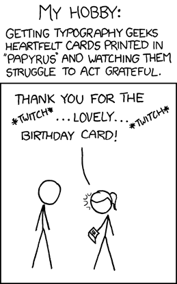
I don't understand the hate for Comic Sans though, particularly in this context. It was made for comics, and as the Giant said, is one of the few common comic fonts that has sentence casing. (Which of course is handy for making shouts or other emphasis stand out.)
Regardless, no point changing it now or readers getting upset over it. Originally Posted by The Giant
Plague Doctor by Crimmy
Ext. Sig (Handbooks/Creations)
-
2011-08-22, 10:24 AM (ISO 8601)Bugbear in the Playground

- Join Date
- Apr 2006
- Location
- Arizona, USA
- Gender
Re: Font rage
i for one am a member of the society for the conservation of capitals, and i get ticked when people overuse capital letters in everything. did you know a cap letter takes 125% of the electricity to display on your screen, and 175 percent the bandwidth to transmit to others?
Writer, editor. See my works at http://theleakingpen.net
-
2011-08-22, 11:15 AM (ISO 8601)Bugbear in the Playground
- Join Date
- May 2007
- Gender
Re: Font rage
It's not just an artistic choice. Even if you don't notice it happening, your reaction to a text is influenced by font choice whether you set the article down after half a page, whether you find yourself agreeing with the author, whether you buy the deodorant. You may not be able to put your finger on it, you may not even consciously note the difference between your response to one font versus another, but I guarantee it has an effect on you. Just because you haven't analyzed your response to something doesn't mean you have no response. Originally Posted by King of Nowere
And it's not just an artistic choice because the utility of a font depends on its design. To take one example: how easy is it to tell "rn" from "m" in the font you're using? In this little post it doesn't matter; in a 500-page book, that, and the hundreds of other tiny choices that go into making a font, all add up and affect how people read it.

 )
)


 RSS Feeds: