
This thread is BEST THREAD.
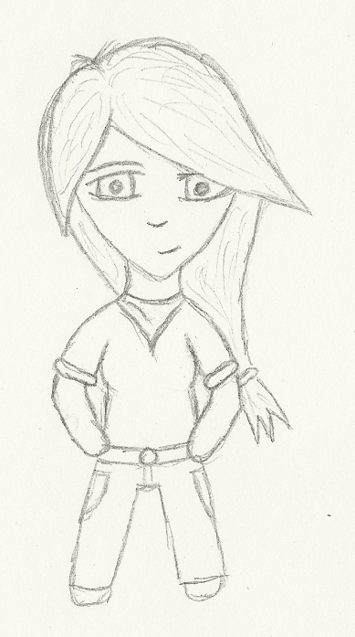
My big advice to you is line colour/width. The reason this looks odd is because you've got very thin straight black lines. They cut through the picture like lasers, separating everything from everything else. Experiment with thicker lines, as well as colour.Originally Posted by Diego Havoc

Also, the clothing in particular looks extremely flat. Try having a look at clothing bends and folds - once you start to get your head around that, things will improve dramatically!
Eyes look good, though!
Freckles! Needs freckles! This is otherwise quite a cool style, but I'm most interested to see it in action poses!
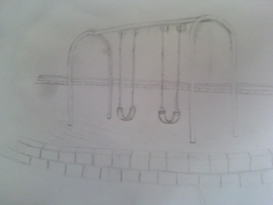
The swingset looks great!
The self portrait is generally good, but the top of the head hairline/shadow thing looks weird and blodgy. If that's a dark shadow, it looks really out of place given how well-lit the rest of the face seems to be. Otherwise this is pretty cool
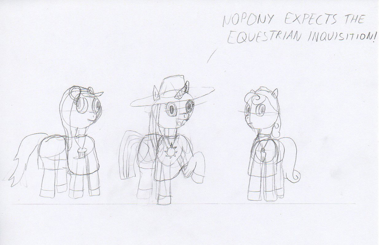
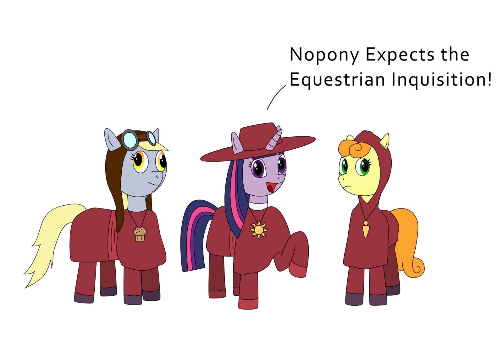
I think that my main problem with this is the mouth shape. Pony jaws are deceptively difficult; it's really easy to make them look too square. Rainbow, for instance, looks like she crashed into a wall recently. Rarity and Twilight look better.
The trick with pony jaws also comes down to line thickness. Look at some screencaps: the nose part is really thick, and then thins out to a graceful curve down along the chin that tapers out. Also merge the nose into the eye a bit more; the curves follow, and it makes the pictures look more harmonious.
The wings, however, look fantastic.
And good luck to everypony! This may seem hard at first, but it's absolutely worth doing! You won't believe your progress if you stick with it.
View Single Post
-
2011-10-30, 06:43 PM (ISO 8601)Colossus in the Playground


- Join Date
- Apr 2009
 Re: Ponythread Learns to Draw! Together!
Last edited by Thanqol; 2011-10-30 at 06:44 PM.


 Reply With Quote