Seconding a lot of the advice above, some really useful advice in there. Keep practicing, keep trying to apply things, keep looking to learn, and pretty soon you'll see a huge improvement!
A couple of notes/things I wish I had picked up earlier, speaking as someone who did a series of similar avatars back in the day (most of which are completely lost to the sands of time):
-composition: try to make a pose that takes up a square as much as possible/is engaging to look at
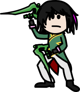
this does better at it, but was largely traced and as a result doesn't have very much... energy.
also, doesn't really take up as much space/is a pretty stock standard pose, if better than the straight forward cardboard shot of ruby
you can tell there's a certain lack of adherence to basic artistic guidelines; see tangents formed by weapons/straight lines where they shouldn't exist, like the pant leg
the hair was done lazily, and looks like a pointy blob rather than someone's actual hair; draw your own outlines to make dynamic and realistic-looking hair
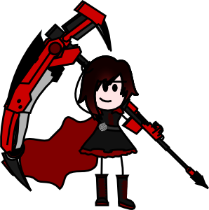
the ruby avatar, too, is just a straightforward poster pose, and really doesn't work without something more interesting such as background/proper shading and composition
i didn't even try on the cape
that said, capes are hard, and i would strongly encourage you to take asterisk's advice of looking at reference for those in particular
on ruby i also did the thing he mentioned with the rose symbol; it looks great close up but is completely lost at a smaller size, and the skirt and clothing don't make sense at all in either a real world context or from the perspective of source material, reference is key there again until you're familiar with how real clothing behaves
the line width is too skinny, especially at an avatar-scale size, the black-red gradient in the hair looks bad, you can tell that there's no attention paid to proportions-- look at the length of her legs and arms
and trying to include the scythe like that was a massive mistake; the detail is lost at any smaller size and it completely clashes with the level of refinement of the rest of the character
if i were to redo these, i would emphasize:
-composition
-reference/making sure clothing/proportions make real world sense as much as they can
-consistency in detail and style
-emphasize key elements that make the character design like it is, and don't try to draw a detail unless you first understand how it works/make sure to use color properly/enough of it
and i think these principles are at the core of a lot of what makes a good avatar
it's easier said than done for certain, but if you nail each of those, it's hard not to make something that's engaging for the viewer, makes sense within your frame of reference, and has the spice or pop of the original character
hope that helped/built on the other advice, it's often easier to see your own mistakes if you see mirrors of them in other people's work?
that said, you do have a decent grasp of proportion and line weight, and i'm looking forward to seeing you improve/seeing what you make
keep up the good work!
View Single Post
-
2018-02-13, 01:54 AM (ISO 8601)Troll in the Playground


- Join Date
- May 2012
- Location
- California
- Gender

 Re: OotS Style Art/Fanart Showcase VI
Last edited by Cuthalion; 2018-02-13 at 02:11 AM.
Spoiler: Quote(s) Originally Posted by Temotei
 Originally Posted by Kneenibble
Originally Posted by FinnLassie
Originally Posted by Kneenibble
Originally Posted by FinnLassie
"So whosoever is a hedgehog let him see to it that his wife is a hedgehog also, and so forth."